[5 / 3 / ?]
Quoted By: >>13728872
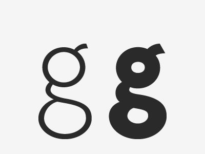
I hate fonts that display g like this.
Doesn't even fit in with the other letters.
Looks like its from an alien language.
Even fonts that are otherwise perfect,
instantly ruined if they use this for lowercase g.
Doesn't even fit in with the other letters.
Looks like its from an alien language.
Even fonts that are otherwise perfect,
instantly ruined if they use this for lowercase g.
