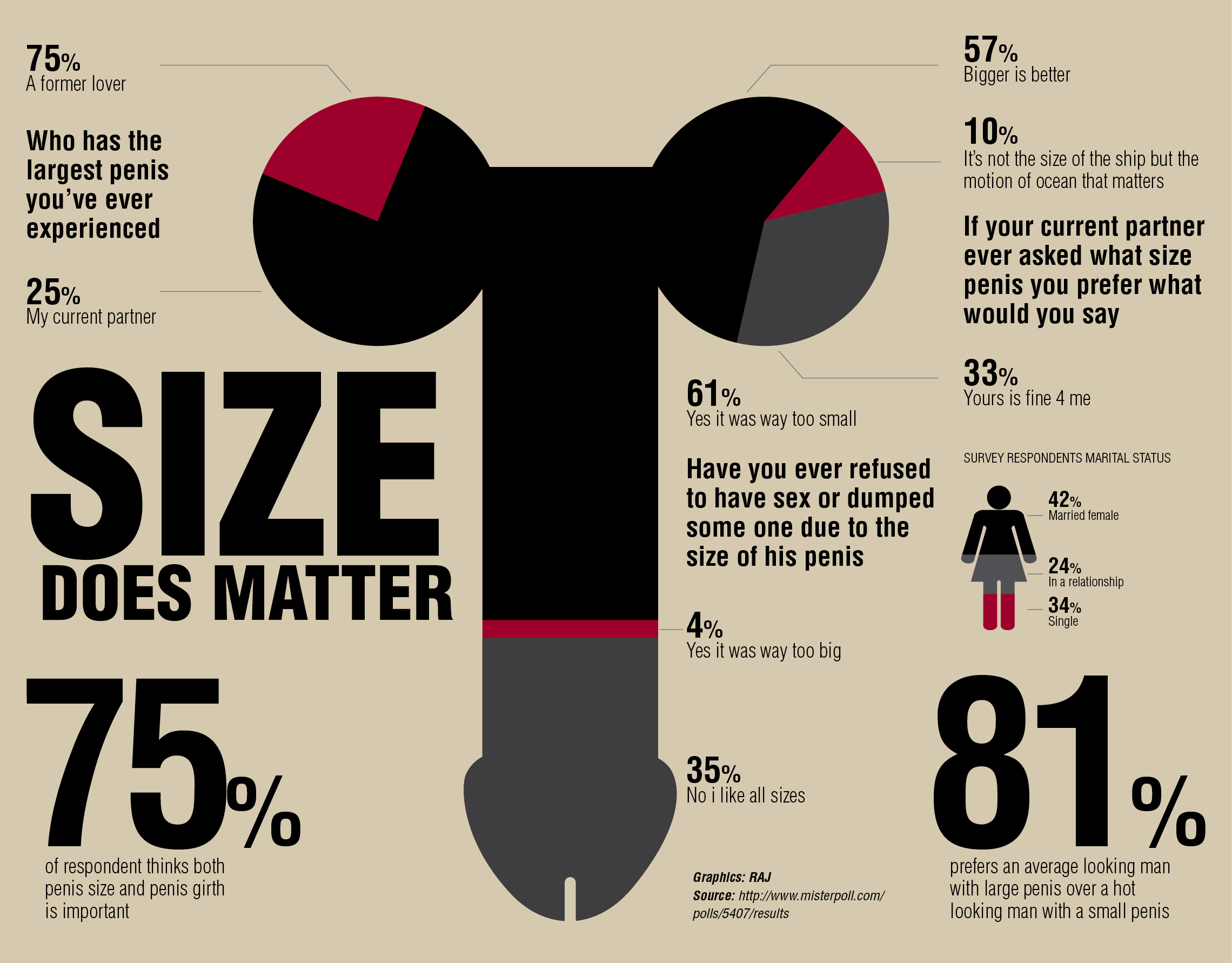
What the actual fuck is this.
"Hey man, I have all this data, should we make it easy to understand?"
"Nah, mash it all together in a jumbled image, you shouldn't be able to tell what's going on and make sure that you use both pie charts and a bar graph of sorts for extra confusion. Hell, if you can just connect the two types of graphs for even more wtf then that'd be just fantastic"