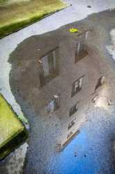
>>3972447This is the best one in the thread, imo. You picked a stronger image to start with. Yellow and blue make a good combination (personal preference, not gonna lie), and you've framed the puddle with blocks of colour, the puddle in turn framing the reflection of the building, naturally. Beige makes a nice mid-ground between yellow, blue, and grey, too. The weight you've given the elements is very pleasing. Aim for more like this
>>3972448This one's too generic for my taste
>>3972450>>3972452I'd suggest trying to choose between one. If you're sure that both work, okay, but be sure about it.
The scene's kind of cluttered, though, and I don't see what value the buildings in the background add. The second one's got a nice leading line in the crack in the ground; if you can get back to this spot, see what you can do with that
>>3972455Same as above, I don't see what value the building in the back adds. I think you'd have been better off including more of the hose that's on the ground there. The regular, circular shapes of the pipes contrasts well with irregularity of the hose, plus the latter makes another good leading line
It's good that you're thinking more about composition. Keep thinking about it and keep shooting. I hope you reflect on and analyze your own photos, too

