[39 / 28 / ?]
Critique thread, roast our shitty pics.
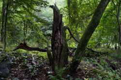
Specific advice on composition and especially color would be helpful. Trying to get back into things after a bout of depression so I'm pretty rusty with my editing skills. This first one was underexposed so I'm wondering if the foreground/tree looks fine without having blown out the brighter area in the back.
I also don't know how to edit colors correctly at all since I only ever learned b/w, so general advice on that would be great

