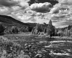
>>4330968Technically a good photo, but as
>>4330970 said
> A cool picture of a cool place but not very artistic. Too much going on. It's a picture of, but not a picture about.A beginner's landscape formula is to have something interesting in the foreground, the midground, and the background.
You have nothing in the foreground.
Contrast that to
>>4331555 where you have the stacked rocks in front, the large slabs and fallen tree in the middle, and those large slabs likewise draw your eyes into the background, which has nothing of interest.
This ends up being why landscape photography can be hard work. Sure, you could've found a flower or interesting tree or something in that first photo to create a better foreground and an overall better picture, but it's still pretty mediocre. In a good landscape photo you're going to put in a lot of work to find something stronger, something with more to say or more to inspire. So it can take an entire day's hike to find that, or even weeks or months of exploring an area, to find one photo that's worthy of your portfolio. (Or, you could just find it already discovered and copy what hundreds of photographers have done before you. Totally legit, and a good way to practice, even if it's still your duty to continue attempting originality).
>>4331555My main concern here, other than a boring and noisy background, is it's unbalanced. The rocks are pushed to the left, while it's a big empty slab to the right.
Try revisiting this area early in the morning when it's foggy or something, and get a different composition. But don't stack rocks yourself, kinda a dick move.

