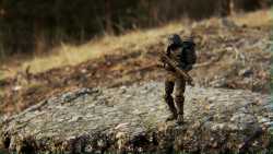
>>10303058The whole composition of it is neat (good effect piece combination here) and it's well put-together, but a few criticisms:
1. Lose the filters, it takes what was a nice photo and instantly makes them look cheap and shitty. You went from "hell yeah I'm saving that" to "I don't want this artifact-ridden mushy shit on my desktop" in just one easy step. Filters might impress the uninformed, but anyone who knows photography or image processing will recoil in disgust. Your work is better than that, don't handicap yourself.
2. The pose is decent, but could be better. Hulk's left leg feels a little too dainty for the situation, he looks like a figure skater kicking it all the way up en pointe like that. I would lower it and straighten out his ankle a bit, you can still sell the pose that way. Right arm is also awkwardly posed for this angle. The rest seems good.
Keep at it. You have the bones of something really good here.

