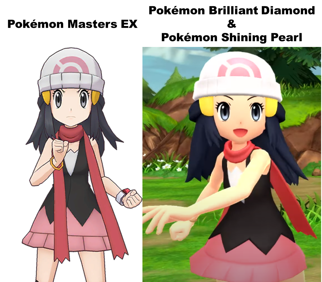
>>46585390it's because the colors and lighting are really, really bad, so outlines are just about the only ways for the characters and pokemon especially to convey what the fuck their design is even supposed to be. for example, just look at the op image as a thumbnail without expanding it. on the bdsp side, dawn's arm blends in with her undershirt, her hat blends in with her hairpins, the lighting is overexposed as fuck so instead of being off-white it's blinding with almost no definition to distinguish the rim, her chin blends in with her neck, it's a skin tone soup that's just unpleasant to look at, never mind her hair being essentially a big blue blob with no definition. meanwhile on the masters side, it's way better, shadows are cel shaded and stylized, outlines clearly define the rim of her hat and adds depth to it, her shirt is clearly defined from her skin tone, each section of her hair is immediately defined, and it does a good overall job at emulating a 2d anime style. basically it's an art style disaster and outlines would at least help a little bit.