>>49344979He's just trolling anon, best designs since HGSS? Come on, the designs are a mess, and Gold/Silver have both the OG and remake gold standard of approval to deflect criticism. It's obvious bait and there's no need to be intellectually honest if the other party legitimately doesn't give a fuck.
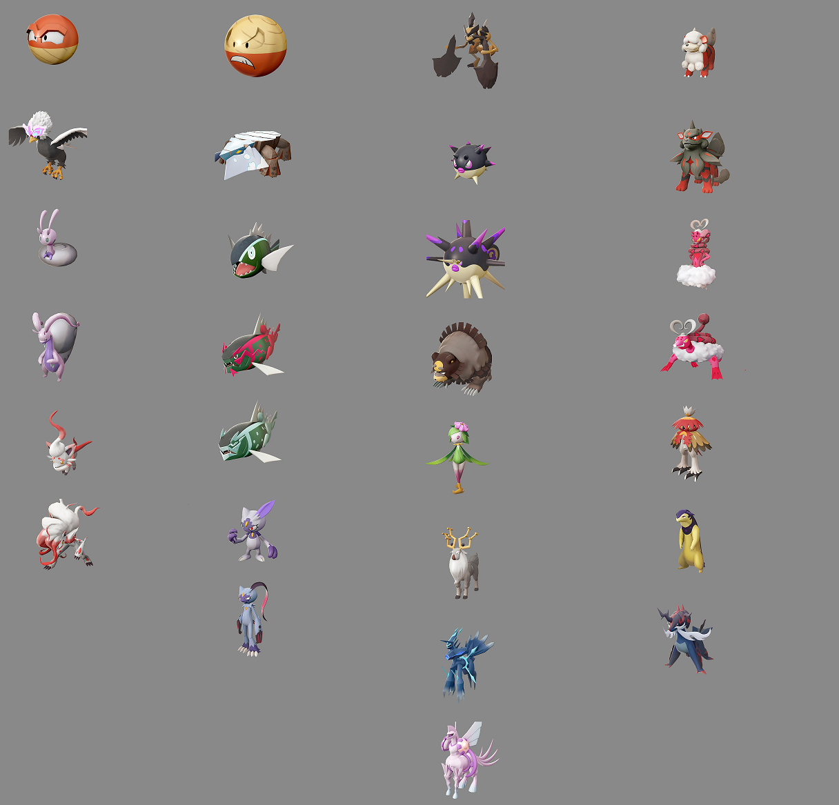
It's no coincidence either that the best regionals were shown in the promos. Basculegion, Weirdeer, and H.Braviary are some of the best in this batch. It's interesting to me as well that the non evolved forms for a lot of these look better than their evolved counterparts. Mainly Growlithe and Qwilfish.
I personally chalk it up to preference. Do I want to use this Pokemon? And it's good to have variety, but overtime the design philosophy in the newer games keeps getting more bizzare. Kalos, while still divisive, had fantastic and memorable designs in a small batch. Those batches keep getting smaller, and at times it feels like rather than having the freedom to design multiple pokemon and explore different styles with simple executions, they're trying to do the opposite. They're cramming as many references, colors, patterns and shapes into a single pokemon to account for the lack of a large roster. Why does H.Voltorb need those eyebrows? It's a mimic, why not incorporate the metal from this region's pokeballs to give the illusion of brows? Why can't the brows be subtle extrusions that soften at the edges? Why does H.Avalugg need the cloud stickers or a jaw that massive? Why does Lilligant need shoes and human proportions when you could achieve more by keeping the small proportions and having her legs be cute purple stumps? Why does Palkia need to keep the pearl pauldrons instead of incorporating it as a crest in the front? They could've also put it on the sides and made it work as parts of a saddle.
The designs feel weird and out of place for the sake of being so. They feel intentionally divisive for the sake of memorability, and that cheapens them in my opinion.