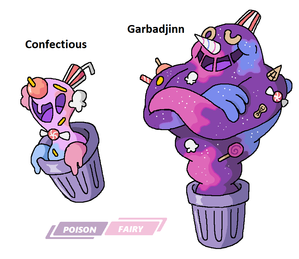
>>50001771Fun concept but Garbadjinn could afford to look less humanoid. The trashcan is also a bit random, maybe a cake mold would work better?
>>50001808This is just an animal on fire, bit boring and a common problem with Greek mythology-inspired Pokémon. Griffins were often associated with Apollo so some sun-like elements or something more abstract could help give the design some much needed personality.
>>50001847waifubait/10
>>50001861Final stage is cool, second one is redundant.
>>50002166Good concept for Dowve but it would probably express "pure Flying type" better if the wings were bigger. As it is it looks like a fat guy disguised as a bird.
Not sure what to think of Shleaps.
>>50002282Decent execution of an old concept, nothing much to say.
>>50002419I like the idea but I'm not sure why it needs to be so humanoid. Second stage is a bit busy. I'd ditch the wand and integrate its elements into the body.
I know the point of the last stage is that it's possessed but you still need more visual continuity with the previous two, plus a more Pokémon-like look in general.
>>50002439Solid design that is just about 20% too busy.
>>50002544Okay but a bit too edgy-looking. Second stage has too many different colors.
>>50002713Concept is a bit contrived but the design looks okay. The green could be a bit more vivid to contrast the black.
>>50002903Ferinch looks okay, Lynger a bit boring (also what's up with those socks).
Also try to come up with shorter descriptions, Pokémon aren't generally described that way.