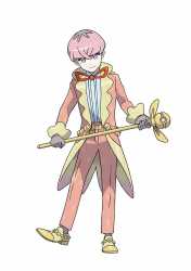
>>52977683I drew arms like the newer art 6 years ago.
Flatness.
The style and designs have always been simple it's very easy to notice a drop in quality when the character is drawn very flat notice the arms to necks on both characters, both very simple yet the older art commits the linework to the character shape using the curves of underlying muscle to get shapes while the newer art's limbs seem to get the point across but are far more formless, where the newer art is almost crude notice the stock anime head shape with lack of organic curve making the face look like a sticker and those boxy ass shoulders was a goto shape when I wanted "Generic Thin Suited guy", like the drawing you'd do before getting to the finished design, but instead of redrawing it better after they just rendered the draft.
Color.
Shadows worse too the warmer tones, more lineart highlights are more appealing than muddy grayness, look at the older art's bowtie, not much shadow because it's closer helping push depth with the neck and face, while the newer's bowtie has a straight shadow over it's corner near flush with the shadow of a collar that's under and going behind his head and the less contrast on the shadows aren't helping it not look like just flats with cell shading and gaussian blur.

