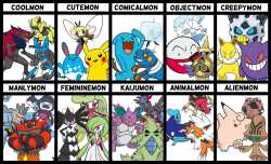
>>53610862>Why they look offTypically when they are overdesigned and the extra details detract from the design rather than improve it, or look "unnatural" in the sense that a wild creature has features to relate to manmade objects or purposes. There is another category of "nu-mons" which are a mix of oversimplified designs (when more detail would be better) and/or poorly proportioned heads, limbs, missing digits, etc. A final category would be Pokemon that look too "individualized" to believe there's an entire species that looks like this, due to a combination of factors like: "job" theme, specific outfits/clothing, carrying additional items/tools, or have some unique trait to make them "special" (Lucario's aura, starters in recent games, etc.)
>When this startedArguably with Gen 3 or 4; I personally lean towards 4. While there are a few exceptions that fit one or more of these design tropes in Gens 1-4, I think 4 is when they started to affect a significant portion of the new monsters and dex as a whole, with 3 "testing the waters" on a few designs. I can give most of Gen 3 a pass on this, as it was mainly limited to patterns (zig zags,etc) on the Pokemon which do occur in nature.
>Examples of when this started in Gen 4-All the Gen 4 starters. Good designs with 1 minor flaw (Torterra all having the same tree and boulder spikes, Infernape's swirly armor plates looking unnatural, Empoleon's circular tuxedo trim on the belly.)
-Yellow bands/stripes on the Shinx line.
-Bastiodon's shieldface looking like a castle wall with windows (man-made structure).
-Garchomp's extra spikes, and I say that as someone who likes the design and spiky Pokemon in general.
-Lucario's spikes, shorts, vertical mask stripe.
-Roughly half of the Gen 4 new evolutions: Lickilicky's belly wifi symbol, Rhyperior's construction worker getup, Dusknoir's stripes and belly face.
t. Playing since Gen1

