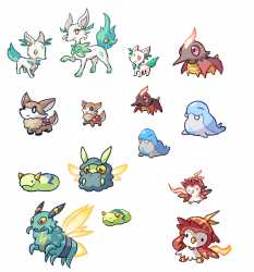
>>53815680these don’t look like Pokémon, let alone starters
the crab and ant(?) don’t communicate their typings clearly enough (the most subtle a starter has ever gotten was probably Litten; almost every other one has explicitly had some very simple fire/water/grass iconography or feature),
the toad and the crab having their eyes not only closed but also explicitly quite small doesn’t fit the emphasis on expression many of these designs prioritize,
the strange features on the ant and crab (namely the castanet claws and the weird looplet antennae) detract from the simplicity of the concept and the castanets especially seem counter-intuitive for its basic function,
and it’s also worth noting that going this far with the eye shapes is better-suited to regular mon as opposed to the starters
The proportions also seem haphazardly stylized- whereas the ant places cartoonish emphasis on its fists and head, the frog and crab remain almost realistically-proportioned in comparison: the frog and crab have quite small hands and limbs in general alongside decently-sized heads that don’t look about as big as their torsos (unlike the ant, which is an outright bobblehead)
overall, it’s very inconsistent and the designs don’t fit the tone of the franchise very well- they’re too generic and lack a lot of the simplistic iconography typically seen in starters that makes their typings and design purpose instantly understandable
you could put these on a generic-brand shower curtain and nobody would think otherwise

