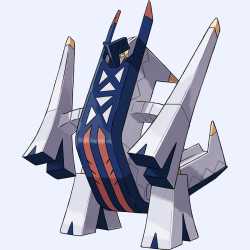
>>54224916>its* silhouette doesn't resemble anything, that's the problem. And yes, it is a problem, because a strong silhouette is the first rule of character design.Strong sillhouette =/= looking like a previously recognizable thing. You can tell its Archaludon by its sillhouette. Ie; it is good
>No it's not, it's stupid and immersion-breaking.No it isn't, it reinforces the fantasy world Pokemon has always been set in. Ie; it is good
>yeah the function of being an eyesore for ledditors like you to jakface overAnd to stabilize its center of gravity and allow energy flow to fire focused high powered energy beams. Ie; it is good
>I never said "most" did. Go back to school Rajesh maybe and learn to read and write proper English.I never said you said most did, just pointing out that most others dont and Archaludon follows Pokemon's pre-existing design trends Ie; it is good
>it doesn't. it adds yellow to the palette which is a complimentary to purple. It has purple nowhere in the design.Duraludon already has yellow in it's design, colorblind-kun. Yellow is also a complementary color to blue, which both Duraludon and Archaludon both have. The highlights of the red and yellow are also both hue shifted towards orange, which helps in presenting them as blue's opposite color, which creates a sound visual contrast. Ie; it is good
>no, it looks like a steel/electric type, especially with all the yellow energy in the bridge form.It also has a draconic form, clearly influence by Kaiju, which have historically been translated as Dragon type. Ie; it is good
>only because people know it's true and treat it like a meme because they don't know how to counter-argue.Incorrect, and Archaludon is not overdesign. Ie; it is good
>no it doesn'tNo other design looks like Archaludon, thus it is objectively, quantifiably unique. Ie; it is good
>that only makes you more of a tastelet, not less.Archaludon is desireable, and thus worth putting on a team. Ie; it is good

