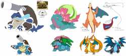
>>56669392>Venusaurbeta looks like a whole different species. the one we got meanwhile looks too similar to normal saur. all it has going for it is the extra foliage being jungle like. would say the least offensive megas are the ones closest to the OG designs, but its still no risk/no reward. a small downgrade, as gen 6 tends to babify designs, especially when making new forms, such as the flower and markings on this one. the modern artstyle does injustice to megas if the appeal to many is to invoke pokegods.
>Charizardbeta zard is hideous, un-charizard like face, the stove holes dont belong on any of the more naturalistic fleshy creatures and the thick wing segments also look like shit. the fire pipe idea would be great on a new original mon but not here. final's X is too similar to basic in build and Y reuses basic's colors making people also see it as too similar, so same problem as venusaur. X does have the cool flame mouth and colors while Y has the unique horns, ripped wings, and arm wings, and they both also have the underbelly extend to its jaw which is an underrated detail. would be peak if they merged them instead of doing 2.
>Blastoisebeta and modern are hardly different. I like the idea of using wartortle fur or whatever but hate modern facial hair designs. this one didn't do it badly but it would've looked worse once sugi drew it. arm shells are stupid. ideally it would keep the main tank canon but I always thought its Gmax looked cooler anyway, which I can't say for the other two.

